We have a screen!

So in my last post about my arcade game design, I had a couple of sketches and a general idea about the shapes that would be involved. With any design featuring a screen (like Error and TV Guy), I always start out designing that part first, since it’s going to be the “face” of the character, and I can figure out the dimensions of everything else based on that.
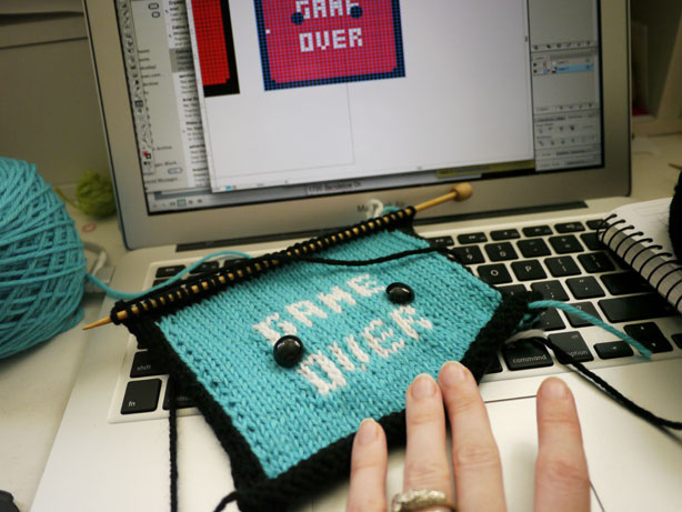
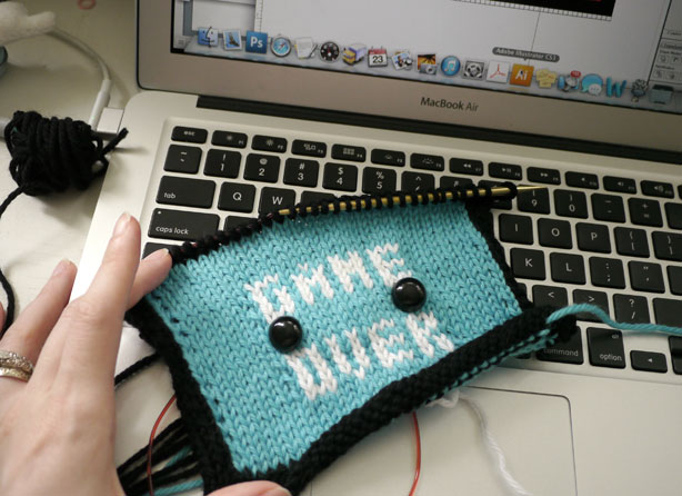
As you can see, I made my intarsia color design on my computer. I use Illustrator for this, because its Live Paint Bucket feature lets you make a grid and then fill in colors really easily. But even when I make it on a computer first, sometimes I need to make adjustments after knitting. This was my first version of the screen:

It was’t tall enough the first time around. You might wonder why I didn’t just make a grid with more accurate stitch proportions on my computer—the reason is just that I’ve never bothered to make a “master” grid to start with, and that’s something I should probably do. Just because I’ve been designing for seven years doesn’t mean that I’m always organized and doing everything the most efficient way possible.
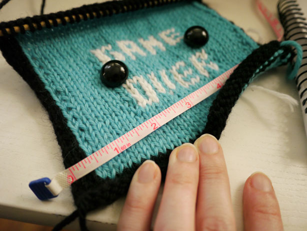
After finishing a screen that I’m happy with, it’s time to be a little more specific about figuring out the rough dimensions and stitch/row counts for the rest of the project. That means doing something that I actually don’t do that often: checking my gauge.

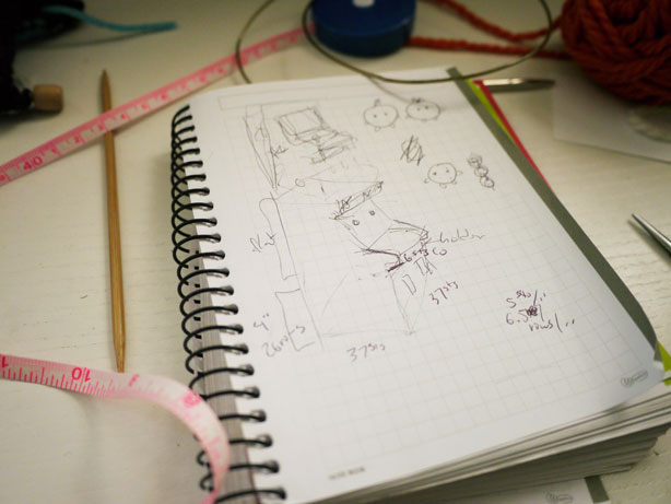
I tend to only do this when I’m designing something with more structure and strong angles, and not when I’m making an animal or other character with mostly round shapes. My gauge-checking is not so complex (just measuring how many stitches and rows per inch, then doing some multiplication), but it’s helpful as a guideline for how many stitches to cast on and how many rows to work on the base of the design. Another sketch follows, with more annotations.

At the same time, I’m still thinking about what this arcade’s game might be, and how that would affect the design. If I’m going to use more intarsia on the cabinet, I should at least have a general idea of what that will look like and where it will start. I hope to figure that out and get started on the rest of the piece soon. Stay tuned!

I love the overview of the design process here. Are you hoping for a more old school arcade game (Centipede, I’m looking at you!)? Those normally had black screens for the game over if I am remembering my misspent youth right. I’m sure it is going to be awesome no matter what!
Loving this design Anna!
This is going to be so cute!! (as always) But this one looks especially wonderful!!
I’m definitely going for an old-school look, but I want it to be cute and fun, and make it come across as an original game. I knew I wanted the cabinet to be black (at least for now), so that’s why I went with a blue screen. (I also thought about a red screen, like you see on my computer, but when thinking about it as Super Mochi Sisters, I decided it should have a friendlier-looking color.)
Awesome, can’t wait to buy that pattern, it will be an awesome addition to my collection!
Awesome! It would be really cute if the arcade games were all homages to other characters/work from Mochi Mochi land like gnomes vs. snowmen, the branch ecosystem from your installation in Germany etc.
Cool! I’m wondering if you pull out the knitted piece that you are unhappy with and reknit with them or you just keep them and knit another one?
Wow. It looks so awesome! I’m going to learn how to make bigger projects so I could try to make this one!