Ever wonder how I take those background-free photos of my toys for my patterns and shop page? It’s today’s Shop Talk topic!
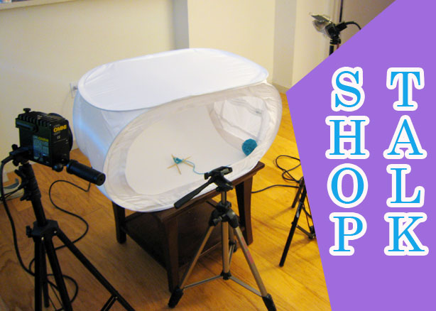
This is going to be an image-heavy post, so click to read on…
Let me begin this entry by saying that my only credential in photography is the “Best Photographer” award I received at Girl Scout camp in 1993. So aside from the Girl Scouts, my photography training has been an early Google search for “product photography how to,” some things I’ve picked up from watching my book photographer at work, and good old-fashioned trial and error.
I should also begin with some examples of the kinds of photos I’m talking about!

With photography in general, natural light is pretty much always the best (and cheapest!) option. But if you’re looking to take photos that have consistent, even lighting, you’ll get the best results with an environment that you have more control over, and that means artificial lights and a seamless background. This is what my own setup looks like.
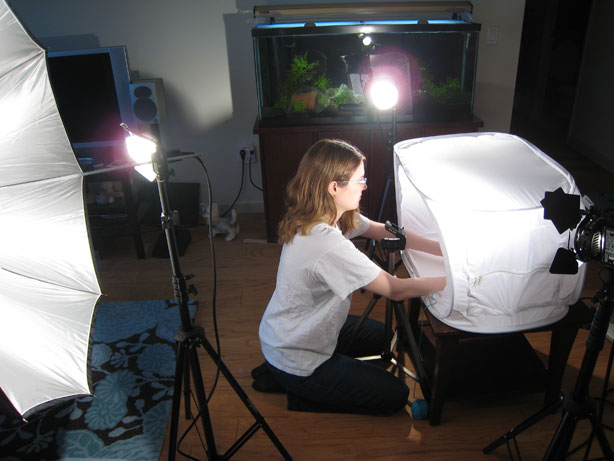
As you can see, I’m kneeling in front of a light tent, with a light on either side of it and one behind me shining into the tent. My camera is missing (because it was used to take this photo), but you can use your imagination.
Supplies
• a table: I use a coffee table so that I can kneel in front of it for my hands-on technique shots. I suppose a higher table with a stool would also work (and might be an overall better idea, now that I think about it).
• a piece of white poster board: Even though I usually erase the background entirely, it’s best to use something that makes that easier. A piece of white poster board placed so that it curves up behind the subject will make for a seamless background, and the white means that the subject won’t have the glow of another color reflected on it.
• a light tent: The purpose of a light tent is to soften the light that shines through it, so that you minimize shadows and bright spots. (This one is similar to the one that I have.)
• 3 lights: Mine are from a light kit that my husband originally got from B&H for video shoots. So I didn’t choose these specifically for product photography, but these were free, and that’s a good price for me! Two of the lights shine through the sides and top of the tent, and one light is in front.
• a reflective umbrella: Because I like to get my hands in there (especially for technique shots), I leave the front of the tent open, and because this means that there’s no filter between my front light and the subject, I turn the front light around and bounce it against a reflective umbrella instead.
• a camera on a tripod: The type of camera isn’t so important, and I usually only use the tripod when I’m taking technique shots that require the use of one or both of my hands. (That’s also when my camera’s 10-second delay feature comes in handy.)
• a white t-shirt: Right before I start shooting photos, I slip on one of my husband’s white undershirts. This is just to help make everything surrounding the toy as bright as possible, so that all that light can reflect back to make the image as bright as possible.
This may seem like like a big, expensive setup, but it can really be much simpler—a few years back, I didn’t have a light tent or fancy lights, so I just used two desk lamps with wax paper taped over them and a clear plastic bin on its side to prop my poster board up in.
And if you just want to quickly take a nice photo with what you have on hand, diffuse, natural light can also work. Here’s a setup I used just the other day to take a quick shot of a sculpture I made for the upcoming Pictoplasma Festival.
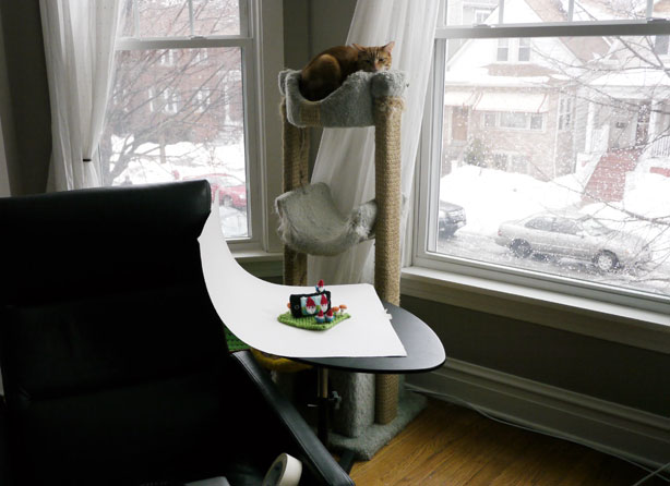
Just poster board on a table, with the top of the poster board taped to the side of a chair to stay in place. (The photos came out pretty nicely, but the piece is still a little under wraps until the festival next month.) An extra tip for using natural light: bounce the light off a piece of white paper (or another piece of poster board, or a big reflector, depending on the size of your subject) to lessen any shadows that appear on the parts of your subject that are facing away from your light source.
But even with all the fancy equipment, your photos probably won’t be ready for public viewing right out of the camera. (And that’s especially true when I’m also using things like masking tape, straight pins, toothpicks, and the occasional double-pointed needle to help get my toy into the optimal pose.)
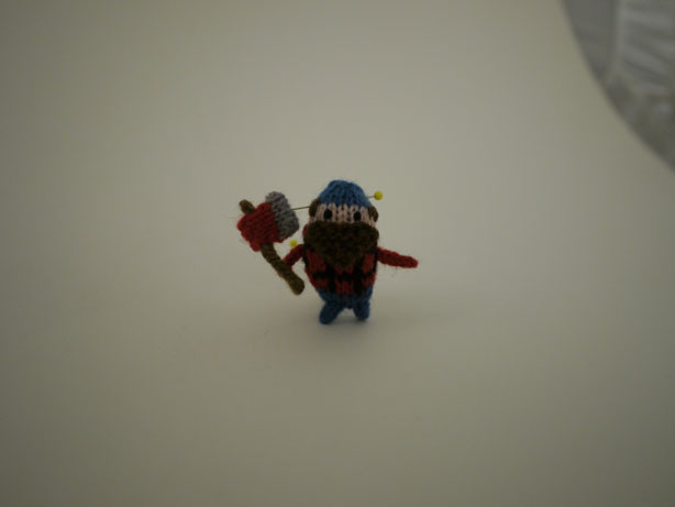
So now it’s time to talk Photoshop. Photoshop is one of my favorite things. If you don’t have Photoshop and aren’t looking to splurge on it anytime soon, you might want to try GIMP—I’ve never used it myself, but from what I’ve heard it can do many of the same things. (It also looks like Photoshop has some different options, so it’s probably worth looking into if you have a budget to work with.)
Whatever photo editing program you use, the big things you’ll want to do are crop, brighten, increase contrast and saturation, and erase the background.
Cropping is straightforward, and since we’re talking about background-less photos, it’s not really important to do until you’re figuring out your photos final dimensions.
I brighten, increase contrast, and adjust colors all using the Curves function (command-m) in Photoshop.
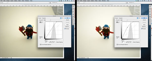
Drag the point at the top a bit to the left, and you’ll see the lighter areas of your image get brighter, and drag a point in the middle to the left to make your image brighter overall. (You can also drag the point at the bottom a teeny bit to the right to slightly darken the dark parts of your image, but that wasn’t necessary for this photo.)
Next, to erase the background, select the background using the magic wand.
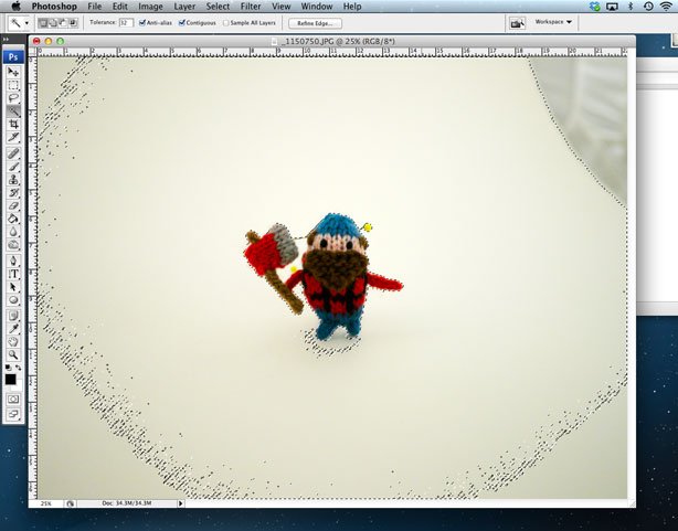
To add areas that didn’t get picked up by the wand, hold down shift and click on them until all of the background is selected.
(The yellow heads of the straight pins are not selected, but I’ll erase those later anyway, so they’re not important. And the background on right right that didn’t get selected is also not important because it’s not close to my subject.)
The quick and dirty method of erasing the background is just to hit delete at this point.
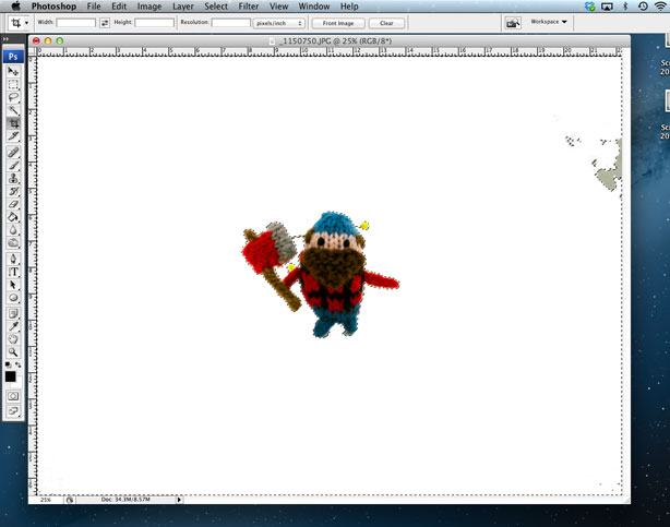
That usually results in weird-looking edges, especially when you’re working with something with light colors. But it’s not so bad in with this guy! So I can just use the eraser tool to clean up the shadows around his feet and also erase the straight pins going into him.
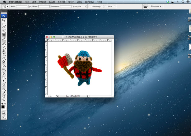
A little more brightening with Curves, an increase in saturation (command-u), and a quick crop to finish, and we have a pattern-ready photo!
But it may not be that simple, depending on your subject. Let’s take these trickier Luvbots as an example.
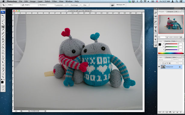
I start by making the image brighter with Curves, then select the background with the magic wand.
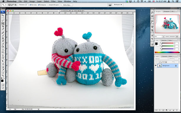
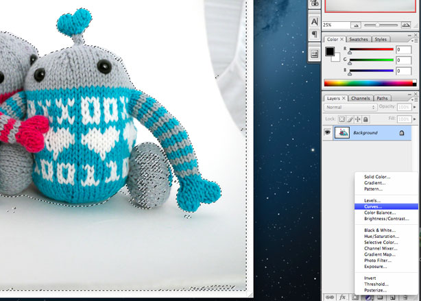
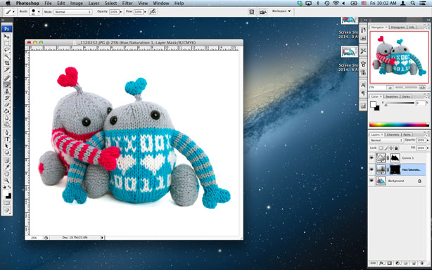
As you can see, the magic wand accidentally selected part of one of the blue guy’s wheels, so just hitting delete at this point would be a bad idea. Instead of deleting the selected area, I’ll make the selected area into an adjustment layer. I do this by clicking on the half black / half white circle at the bottom of my layers window, then choosing Curves from the pop-up menu.
This will bring up the Curves window again, but unlike the earlier adjustment, this one isn’t a permanent change. So I drag the top point over to the left until the selected areas area all white.
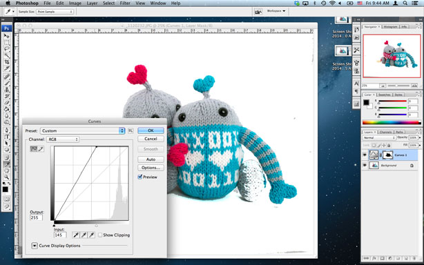
That includes my blue guy’s wheel, but that’s OK. Next I select the paint brush, and set the color below to black. Anything that I paint black in the adjustment layer will become de-selected.
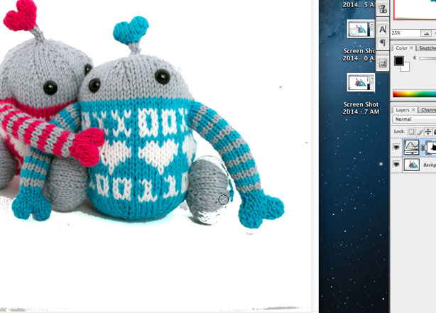
And for any areas that I missed with the magic wand the first time (dark areas that I want to be light), I use the paint brush and white to select them.
Using the adjustment layer and paint brush method is more painstaking, but gives you way more control over the image, so you can make it as clean as possible. And because it’s a layer, you can always undo your adjustments, and you can click on the eye next to the layer to make it invisible, and see what the original image looked like.
After all the clean-up, some saturation increase and cropping, here is our near-final image.
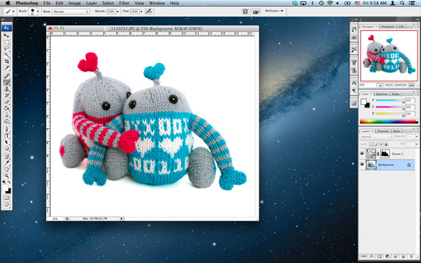
There’s one last adjustment I’d like to make. You see how there’s a blue glow under the blue guy? I don’t mind having a little bit of a shadow, but I don’t want a blue shadow. So I’m going to select the area, this time using the lasso tool…
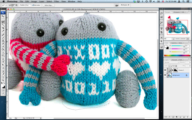
And then I’ll de-saturate just that area by clicking on the black and white circle again—this time choosing Hue/Saturation. Then I turn the saturation way down.
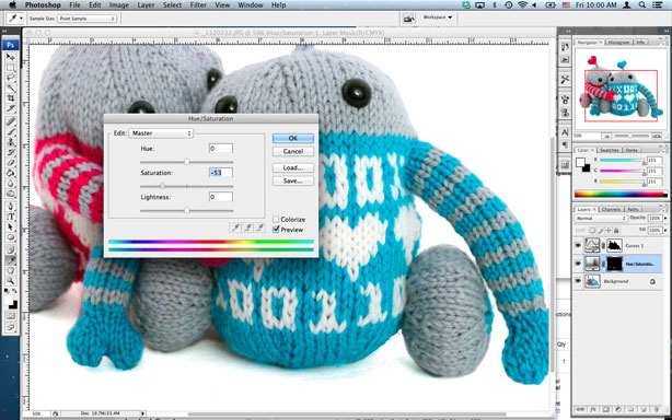
Final results!
That’s my product photography and adjustment in a nutshell! Questions and other phography tips are welcome in the comments.
Previous posts in this series:
Tech Editing and Pattern Testing

Awesome! Thanks for the tips. I’m a fan of the Quick Selection Tool (the one under the wand).
And I have never once used that tool, Kally—thanks for the tip!
It’s interesting how it seems that each person has their own way of using Photoshop to solve the same problems.
Wow!! This is so full of information!! Very impressive! Are you going to Berlin?
Thanks Bonney! No Berlin for me this year. I have a book to write instead!
Awesome… I love Photoshop, but it can be a bit of a black hole for time (especially when you play around with settings). I forgot about the paintbrush trick in the adjustment layer, time saver!
I have enjoyed this series on your blog; the insight you share is wonderful. A lot of questions I’ve had for some time have been answered in this series. Keep it up!
Anna, this is EXACTLY the post that I needed right now. I’m working on tutorial pics for my pattern and I’ve had a bit of trouble getting things just right. Thank you so much for this post :)
Thanks! This really helped! I just have one question: what version of Photoshop did you use? I’ve been planning to get it, but I’m not sure if the version I’m planning to get (Elements 12) is capable of being that precise.
Thank you so much for taking the time to provide such awesome information. I admire your simple and highly effective set up.
Phia—I have CS3, so not the latest version. But most everything I mentioned in the post is pretty basic Photoshop stuff, so I would just make sure that you are able to work with adjustment layers in the version that you’re getting.
Ok. Thanks!