
This is a bit off-topic, but I’ve always sort of admired these signs that appear in the subway stations of New York City:
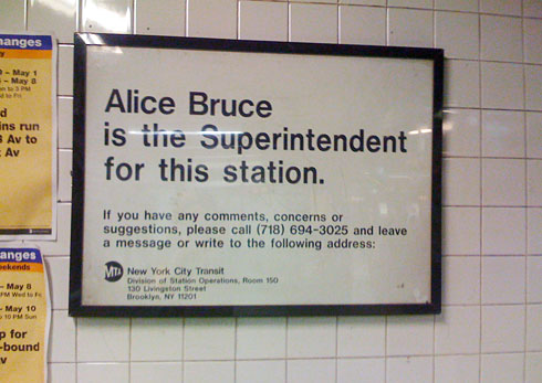
I think it’s the simplicity, the font, and the size of the sign. At first glance, it almost looks like a minimalist ad campaign. Whether or not these notices are meant to be stylish, I don’t know, but something attracts me to them.
I’ve noticed recently that they’re being replaced with a less awesome design, which is disappointing. So before they’re all gone, I took a picture of one at the Broadway-Lafayette station.
Ooh! i love sudways. i know im crazy, but i have been on one once in washington d.c. i dont recall seeing one of those signs though.
what a shame…
I’ve really got to agree – when I lived in New York, I loved those signs as well. Are they being recycled? It could be a great craft project to create something similar for one’s own home…cross-stitch style perhaps?