It seems like the internet is getting more powerful every day, which is cool, but also scary, right? I think that’s why I find extremely simple, possibly useless websites to be so attractive. The art/design website The Fox is Black recently introduced me to some of these sites (which they called “single-serving sites“), and I’m thinking this could be a very deep rabbit hole indeed.
If you have a few spare seconds, click on the below to see some of my favorites.
I think we’re pretty used to silly “toy” apps by now (sound effect apps come to mind), but there’s something really bold about a whole website built upon one simple concept. Websites can do so much, yet these do so little.
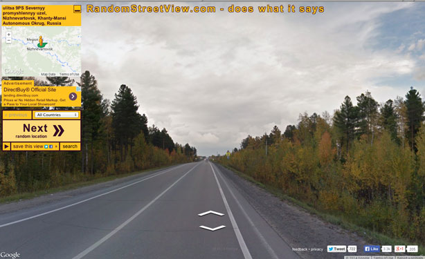
I have one more for you—a simple idea, but mind-blowing nevertheless. Take a virtual stroll through any random place in the world…
As many different things as the internet is becoming, I love that it’s also becoming a place for some of us to create new forms of art and play and for the rest of us to enjoy the results.

Those are crazy…I think my favourite is the blue ball machine but there is so much going on I am missing a lot. And the koala one, how does someone even program that, awesome. All of them awesome!
AMAZING!!!