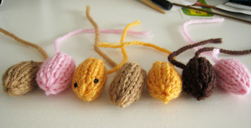
The third tiny thing is a Tiny Fish.
This fish dreams of being on So You Think You Can Dance. I don’t have the heart to tell him that it will never ever happen.

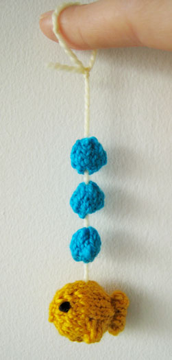
The third tiny thing is a Tiny Fish.
This fish dreams of being on So You Think You Can Dance. I don’t have the heart to tell him that it will never ever happen.
The second tiny thing is a Tiny Volcano.
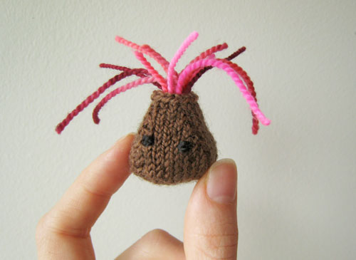
He is sad because all of the villagers are running away. But also happy because now he can destroy their village.
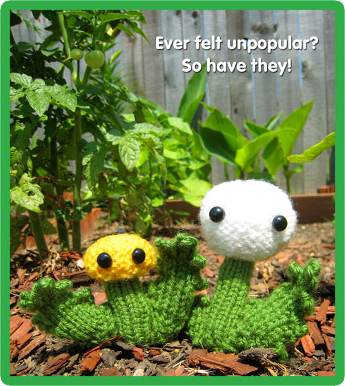
I am tentatively dedicating the month of July to the knitting of tiny things. I don’t have a plan for these tiny things except to challenge myself to make as many new ones as I can. Because everyone loves tiny things!
The first tiny thing is a Tiny Brain.
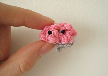
He thinks he’s so much smarter than me because he didn’t just spend the last two hours knitting something small and inconsequential.
Update: Thank you to Becky at the CRAFT Blog for posting the brain!
I like movies, so why not write a few quick reviews of what I’ve seen lately? I might start summing up all the movies I see at the end of every month, just for fun.
In the theater:
I bet a lot of you have seen Up. Up was very good! I liked the character development (and yay for a cute old guy as the hero) and the way that the house served as a metaphor throughout the entire movie. This May New York Times feature on the way Pixar worked on the character designs made me want to see the movie, and it was also a little inspirational. Animation seems like fun (hard work, though).
Not great! I hadn’t heard much about Departures, but since it won Best Foreign Film at the Oscars this year, I figured it was worth seeing. It was like a just-OK made for TV movie: the characters were good, the story was not bad, but it was so sappy and cliche that I was kind of embarrassed to be watching it in public. For me, a redeeming quality was that the Japanese language was simple and so it was fun to follow along. But surely there were other movies made in other non-US countries in 2008 that were much better.
On DVD:
I was reading something about the career of Marlon Brando and that’s why I decided to rent this. He is great in Streetcar! And cute! But the Blanche DuBois character (played by Vivien Leigh) was a complete turnoff. I guess that’s on purpose, but knowing that didn’t make it easier to watch. The theatricality of the whole thing was a bit much for me, but I could more or less appreciate the directing and so on. Seeing Streetcar for the first time also made me want to re-watch that episode of The Simpsons in which Marge and Ned Flanders perform the play in a local theater production. I bet it will be funnier to me now.
I think I rented The Remains of the Day because I had recently read Kazuo Ishiguro’s novel Never Let Me Go and I learned that he also wrote the novel that this movie is based on. And I like Anthony Hopkins and Emma Thompson. The movie was very good—sad and frustrating to see how their relationship plays out, but also interesting to see the day-to-day lives of the butlers and maids in an English manor in the 1930s. If you haven’t seen it, or if you haven’t seen it in 15 years, I would recommend it.

This 1981 movie was finally just released on DVD. If you haven’t heard of it, it’s two guys eating dinner and talking for two hours. Quite literally! This is my favorite line from the film:
“OK, we are bored. We are bored now.”
At least at that particular moment, it perfectly summed up how I was feeling about My Dinner with Andre: a lot of the time, I found myself wanting to interrupt Andre (played by Andre Gregory, as more or less himself) and change the subject from boring artist-hippie retreats to something, anything else. It certainly was a different kind of film, and that was a little interesting, but I just wish that the conversation had been a little more balanced. Wallace Shawn (also playing himself) makes some attempt to counter Andre’s nonsense in the second half, but they’re both speaking from within what seems to me like a very dated worldview (dated even for the early ’80s), in which people and experiences are either “fake” or “real,” with nothing in between. Bleh.
On TV:
Sometimes I watch (usually bad) movies on TV because I have nothing better to do, but not this month.
Other:
On Friday John and I took a bus to New Hampshire, and the traffic getting out of the city was so bad that the driver played two movies instead of the usual one. The second one was Last Chance Harvey and hey, I like Emma Thompson, and Dustin Hoffman has his charm too. Too bad that the movie was pretty mediocre, even for a romance about an older couple. I don’t really have much else to say about it, except that it was a fine way to spend a couple hours of a 7-hour bus ride.
Boy this post turned out much longer than I had expected! Maybe in the future I’ll just write about movies as I see them instead of saving them for the end of the month.
This is a free and easy pattern for everyone to enjoy. Please check out the Mochimochi Shop for more patterns that you’ll love!
These used to be arms that turned out to be not the right size for what I was making. I’ve kept them around for some reason, then one of them picked up a pair of eyes somewhere. Strange!
They seem to be somewhere between arms and little creatures now, so I’m having trouble throwing them away or frogging them.
Finding neat things you had forgotten you had is fun.
I just re-discovered this cute little Aranzi Aronzo tin that I got in Japan last year.
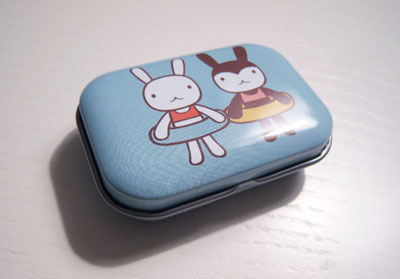
And I also discovered that it makes the perfect stitch marker holder!
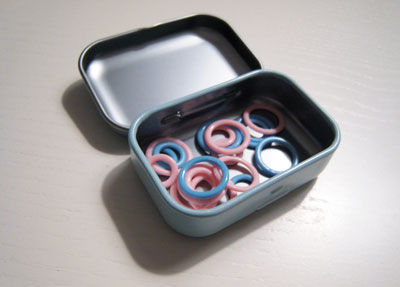
No longer will my stitch markers be spilling all over the floor every time I get one out to use. At least that is my hope.
Hey everybody! I’m writing about knitted toys right now for something special to be published in the future, and I’d like to ask for your help!
I want to come up with a fun list of the different kinds of people that we knit toys for. Who have you knit toys for as gifts? I’m especially interested in hearing about more unconventional toy recipients—someone with an interesting occupation, such as a truck driver, or maybe someone with an interesting relationship to you, like your great-great-aunt.
Ideally, I would like like to hear about people for whom you’ve knitted Mochimochi Land toys, but any kinds of knitted toys are OK.
So, who have you knitted toys for, and what did you knit? Please comment! (And thank you for your help!)